Brand kit
The mark
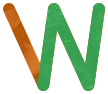
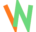
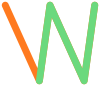
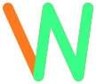
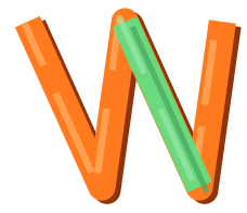
One monogram, two letters. Four strokes: the orange one belongs to the W alone, and the three green ones are a Z lying on its side. Rotate the mark ninety degrees — either direction, since a Z reads the same upside down — and the Z is just there.
The colour split isn't decoration. It's the construction, made visible.
Everything, in one file
Download the media kit
Every mark including the oil versions and all twenty candidates, the full icon set, the colour tokens as CSS, the social card, and the written guide. Built from the same source the site renders, so it can't drift from what you see here.
Icons
56 shapes on a 24×24 grid, 2px stroke, round caps and joins. They inherit currentColor, so set the colour on the parent. Deliberately not an icon library — this many icons is not worth a dependency to keep patched and licensed forever.
arrow-rightarrow-leftarrow-up-rightchevron-rightchevron-leftchevron-downchevron-uphomemenucloseexternal-linkplaypauselivevideomiccalendarsparklesparkleslampwandheartstarterminalcodefilefolderfolder-treedownloaduploadcopysavetrashrefreshsettingsgitcheckcircle-checkcircle-xwarninginfoquestionlockunlockshieldundoeyeclocksearchbooktaglinkmailrsssunmoon
Every variant
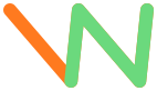
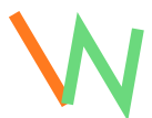
Twenty candidates, generated from one parameter table rather than drawn one at a time. The one in use is marked. Any of them can be swapped in by changing a single line.













Painted, and explored
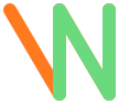
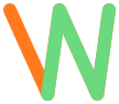
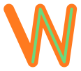
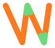
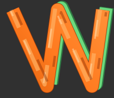
Two follow-ups to the flat mark. The oil versions stroke the real generated paint texture along the identical path data — the pigment changes, the geometry doesn't, so it is still a W at 0° and a Z at ±90°. The explorations are four parallel design directions, each pushing one idea: less green, solid cut shapes, retro-arcade, and paint.





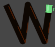
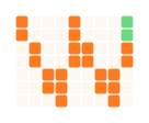
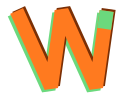

Each direction's own notes — including what its author thought was wrong with it — are in public/media/logo/explore/*.md.
Colours
- Orange
#ff7a1fPrimary. Links, accents, the W stroke. - Orange soft
#ffb765Secondary accent, inline code. - Green
#6bd97dThe Z. Means "granted": done states, live badges. - Terminal green
#39ff88The loud variant of the same idea. - Ink
#14110cBackground. - Paper
#f3ecddText on dark. - Muted
#9c9080Secondary text.
Type
- Display (headings, wordmark): Righteous, self-hosted and subset at build — the page never calls out to a font host at runtime.
- Body: the system UI stack. Fast, familiar, nothing to download.
- Monospace is reserved for things that are literally code — commands, prompts, file paths. Never decoration: setting UI labels in a code face makes a site for non-developers look like a developer tool.
Using it
These assets are free to use when you're talking about or linking to the show. Give the mark about one mark-width of clear space. Don't stretch it, add shadows or gradients, or recolour it outside the palette above — and please don't use it in a way that suggests we made or endorsed something we didn't.
Rotating it is the one exception to the usual "don't rotate the logo" rule. Rotating it is the point.
Files: the mark ·favicon ·contact sheet. Need something else — a transparent PNG, a particular size? contact@wishbusterz.com.